Start with Style
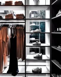
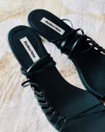
For this exercise, I built my moodboards around developing a fashion collection. However, this same system can work for any branding. The first style board refers to overall aesthetic. References of similar products or branding is pulled to illustrate the main concept. In this case, I am creating a moodboard for my “On the Banana” collection. This collection is mean to be designed for a young female demographic ages 21-35. As the name suggests, hints of yellow appear against contrasting black. The online references pulled feature outfits on models that are edgy, powerful, and eclectic.
The first style board refers to overall aesthetic.
Colours and Textures
Colours and textures play a significant role in communication not only on an emotional level but also a cultural one. The vibrancy can also affect the overall mood that it provokes. Bright and cheerful versus dark and moody can take on two different tones. Dark and moody can involve rich colours that speak to luxury while bright colours tend to reach a younger, wide-eyed demographic.
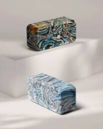
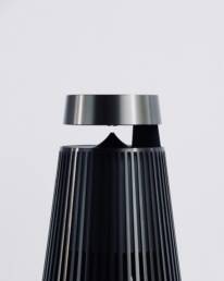
This is the time in the mood-boarding process to get experimental. Textures should be tactile and innovation can explode through combining materials. Don’t be afraid of creative process and allow it to naturally take you to where it’s meant to end up. What helps is first approaching this with adjectives in mind. Answering questions such as: “Is it organic or synthetic?”, “Is it artistic or sleek?” “Is it antiqued or modern?”, “Is it dynamic or static?” Sometimes it can involve both, but there is always a common element tying them together like a single colour.
What helps is first approaching this with adjectives in mind
Get Graphic
The graphics are really a latter phase of colours and textures. All three are very closely related. In this process, the graphics refer to the compositional layout, the fonts, and the media. All of these areas are really open-ended, so it is important to define each and commit to them as rule. The compositional layout should always look consistent across assets. If one asset has text entirely centred, it should all be centred. The photography should have the same treatment and tone throughout as well. Fonts should be chosen wisely and limited. They can have any combination of serif, sans, serif or handwritten, but they should be respected as a communicative element.
It is important to maintain consistency across assets because it ultimately affects the Visual Communication phase. The more concise and innovative you can truly be in your branding, the more people will take notice.
It doesn’t make much sense, but it’s a balance of creating something that people are expecting but haven’t seen before. Visual trends exist for a reason and to completely negate them can mean your branding is irrelevant within culture. On the other hand, there is so much visual noise in our society that it is crucial to stand out.
Visual Communication in the next phase plays a vital role in this because your branding has to speak to values that people care about. It has to offer something to them.
The compositional layout should always look consistent across assets.
All in the Visuals
This board is really about identifying the meaning behind your project and explaining it through semantic means. Highly relevant to marketing, Visual Communication is one of the key vehicles for developing content and communicating with your audience. It should approach them on an emotional, thought-provoking level that ultimately leads them to care about your brand.
The meaning should be genuine and authentic, but there is a lot of flexibility. It can be something very simple or more abstract. The goal isn’t necessarily to make it clear, but to make it relevant. The ability to uniquely communicate your brand through visual assets will ultimately make it stand out from an over-saturated pack.
Show some love: Photo: Jazmin Quaynor and mrtb.studio
Coralie Myrne
Coralie Myrne is a seasoned journalist with a keen eye for sustainable fashion trends, serving as the voice of conscience for "EcoStyle Insights." Combining her love for writing with a passion for environmental advocacy, she travels the world uncovering the stories behind eco-friendly designs and the innovators shaping the industry. With a commitment to authenticity and a dedication to promoting conscious consumerism, Coralie empowers readers to make informed choices while looking effortlessly stylish.

